My work / Verzio
A brand-new consultancy with fifteen years of proof
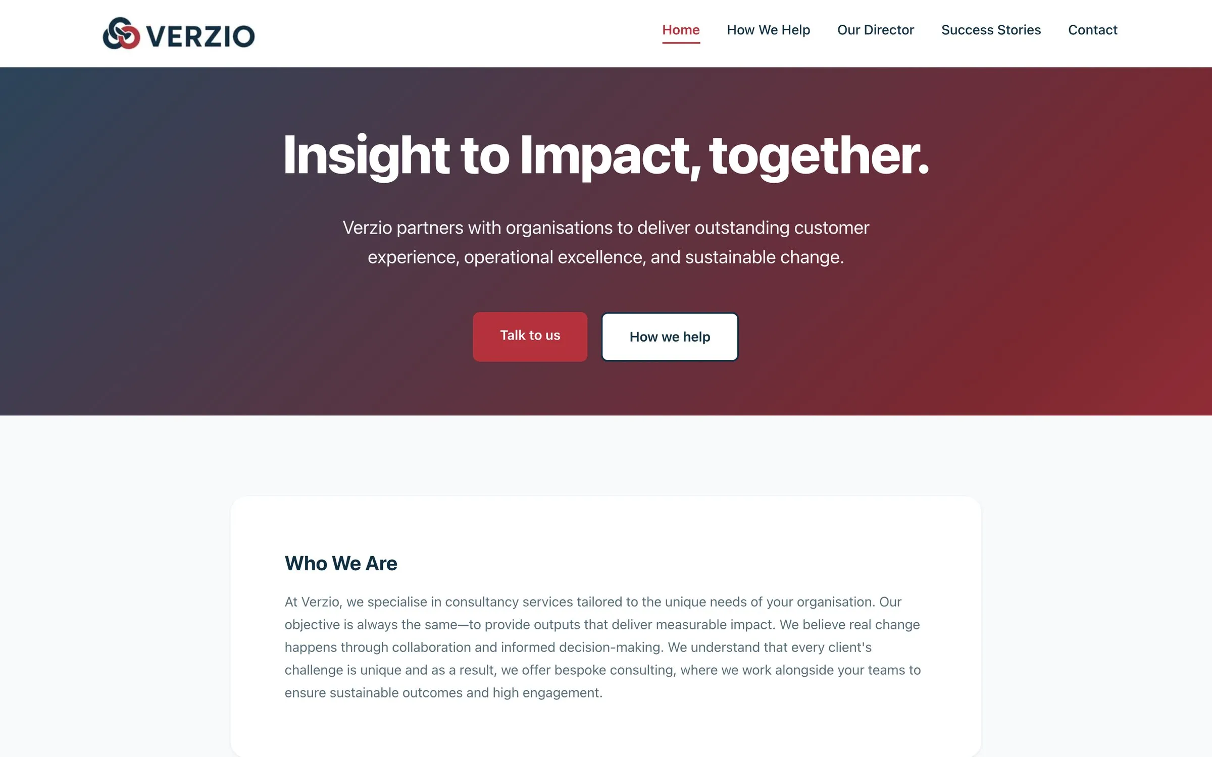
Kerry Matthews spent more than fifteen years improving how universities look after their students, most recently at executive board level. In late 2025 she set up on her own as Verzio. She had the track record. What she needed was a website that could carry it.
- Client
- Verzio, led by Kerry Matthews
- Sector
- Higher education consultancy
- What I did
- Design, build and launch, and I've looked after it since
The trouble with being new
A new consultancy has an awkward problem. The people Kerry wants to work with are senior staff at universities, and before they reply to an email they'll look her up. If what they find looks thin, the conversation never starts.
Kerry's experience was anything but thin. She'd run services, redesigned how whole departments work and led teams with the results to show for it. But on day one of a new company, none of that existed online. The website had to make a business that was a few weeks old look as experienced as the person running it.
What the site had to do
Look established from the first second
Senior people make their minds up quickly. The site had to feel calm, confident and finished, with nothing about it that said “just getting started”.
Explain eight services without a wall of text
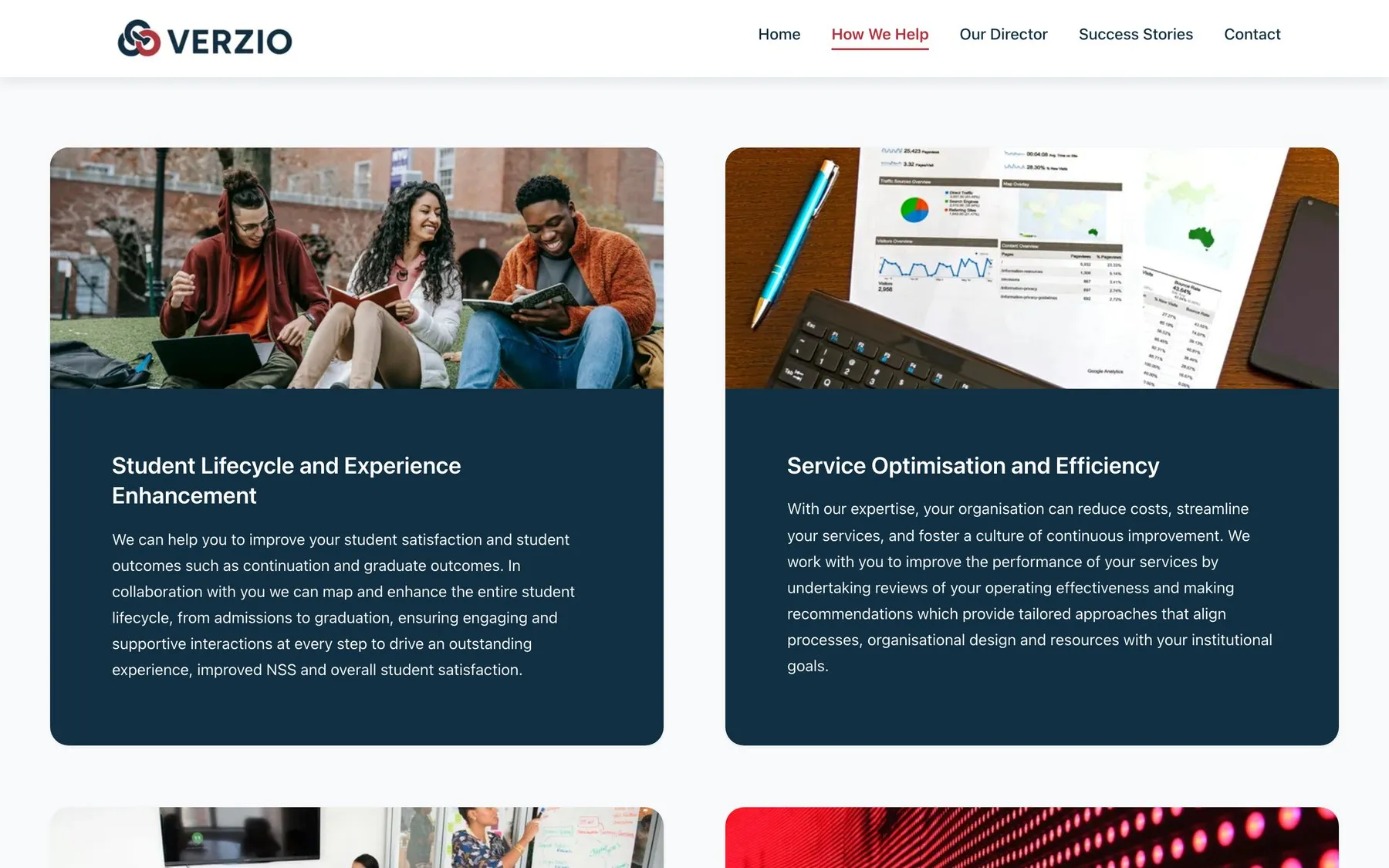
Verzio covers a lot of ground, from the student experience to regulatory compliance. Each area needed its own space and a plain explanation of what it means for the client.
Lead with the evidence
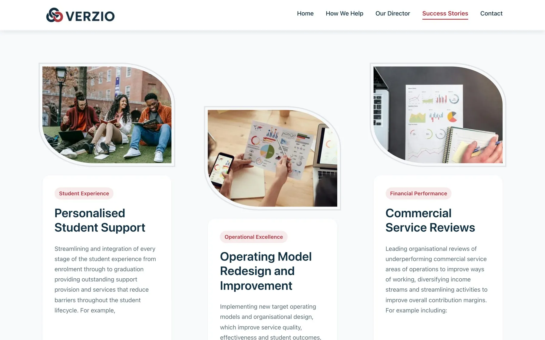
Kerry's results are specific and measurable. They needed to be the thing people remember, so they couldn't be tucked away at the bottom of a page.
Make it easy to start a conversation
Nobody buys consultancy from a website. The site's real job is to get the right person to send a message.
What I built
Five pages, each with one job. The home page says what Verzio does in a single sentence, then offers two ways forward: talk to Kerry, or see how she helps.
The thinking behind it
This is where seventeen years of fussing over other people's websites earns its money. The choices below are small, and they decide whether a visitor gets in touch or drifts off.
One obvious next step
Every page points towards getting in touch, without shouting about it. If someone is ready to talk, they never have to hunt for how.
Four boxes on the contact form
Name, email, organisation, message. Every extra box on a form is another reason not to bother, so anything that could wait for the first conversation was left out.
Honest about being new
Some of the success stories are from work Kerry led before Verzio existed, and the site says so plainly. Being upfront costs nothing, and it's exactly what a careful reader checks.
Made for the phone in their hand
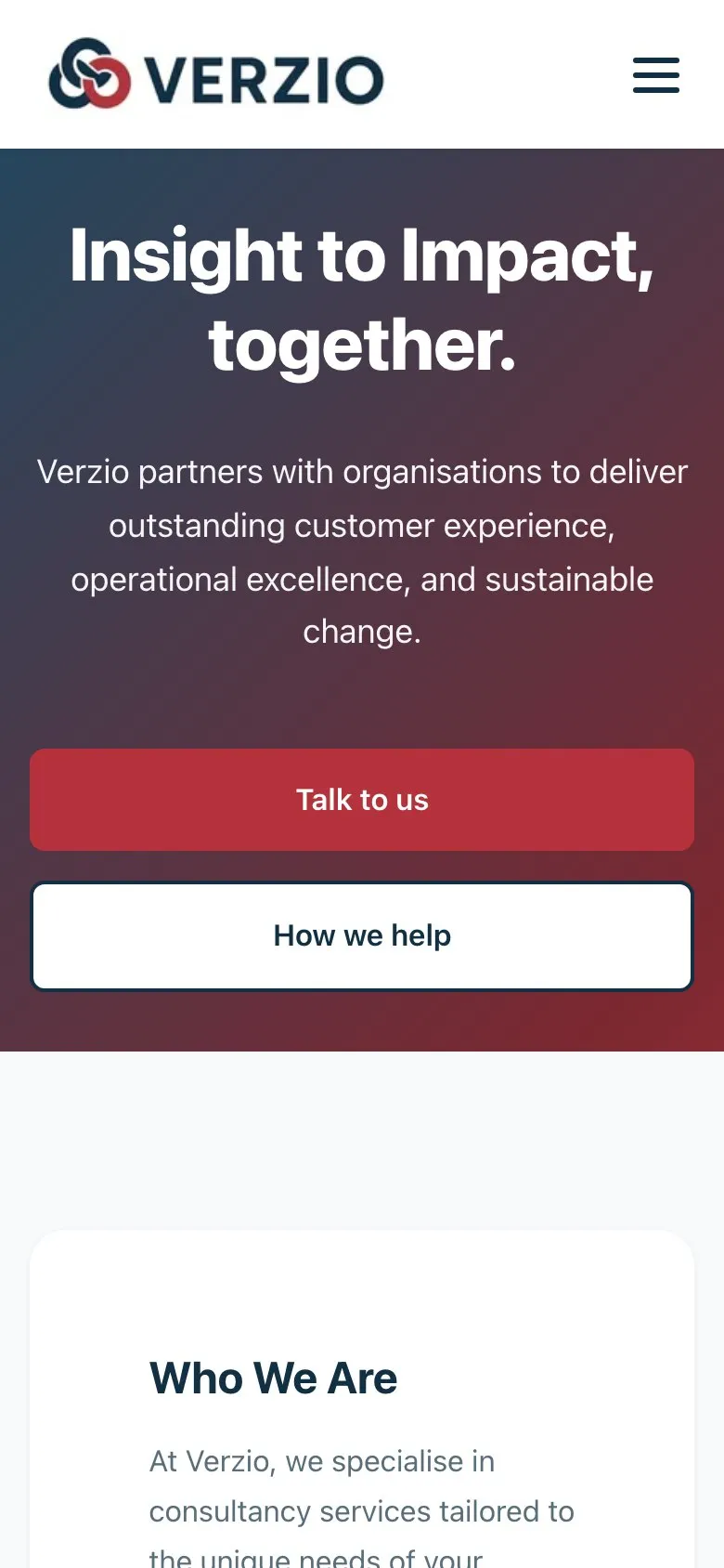
Plenty of people will first open the link on their phone between meetings. The site is designed for that screen, not squeezed to fit it.
Quick, with nothing it doesn't need
There's no page builder underneath. The home page comes in at under half a megabyte, a fraction of what a typical web page weighs.
Still looking after it
A website isn't finished the day it goes live. As Verzio has grown I've kept the site in step with it, adding to the success stories and updating the contact page. When Kerry wants something changed, she sends me a message and it's done.
Want a website that does this for your business?
Your website will have a different problem to solve. Tell me what it is, and I'll tell you how I'd go about it.